

Tastemaker’s - Digital refresh
Role:
Interface (Web)
Digital Identity
Design System
User Experience
Digital Strategy
Art Direction
Tastemakers Africa is a black-owned travel company that curates all-inclusive group trips and cultural experiences hosted by over 200 local entrepreneurs to several destinations in Africa. With over 84,000 instagram followers and over 2k monthly site visits, the founder Cherae Robinson has made a digitally-connected African diaspora her mission core mission during the pandemic. In light of the changing relation between digital and phyiscal experiences, I partnered with her core team to re-structure their site-map and linking strategy while focusing on their homepage, journal, and trip detail page templates ahead of their 2022 relaunch.
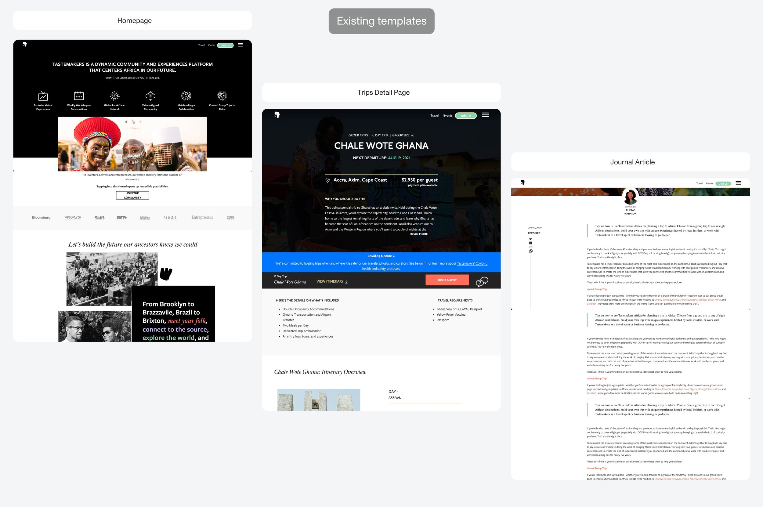
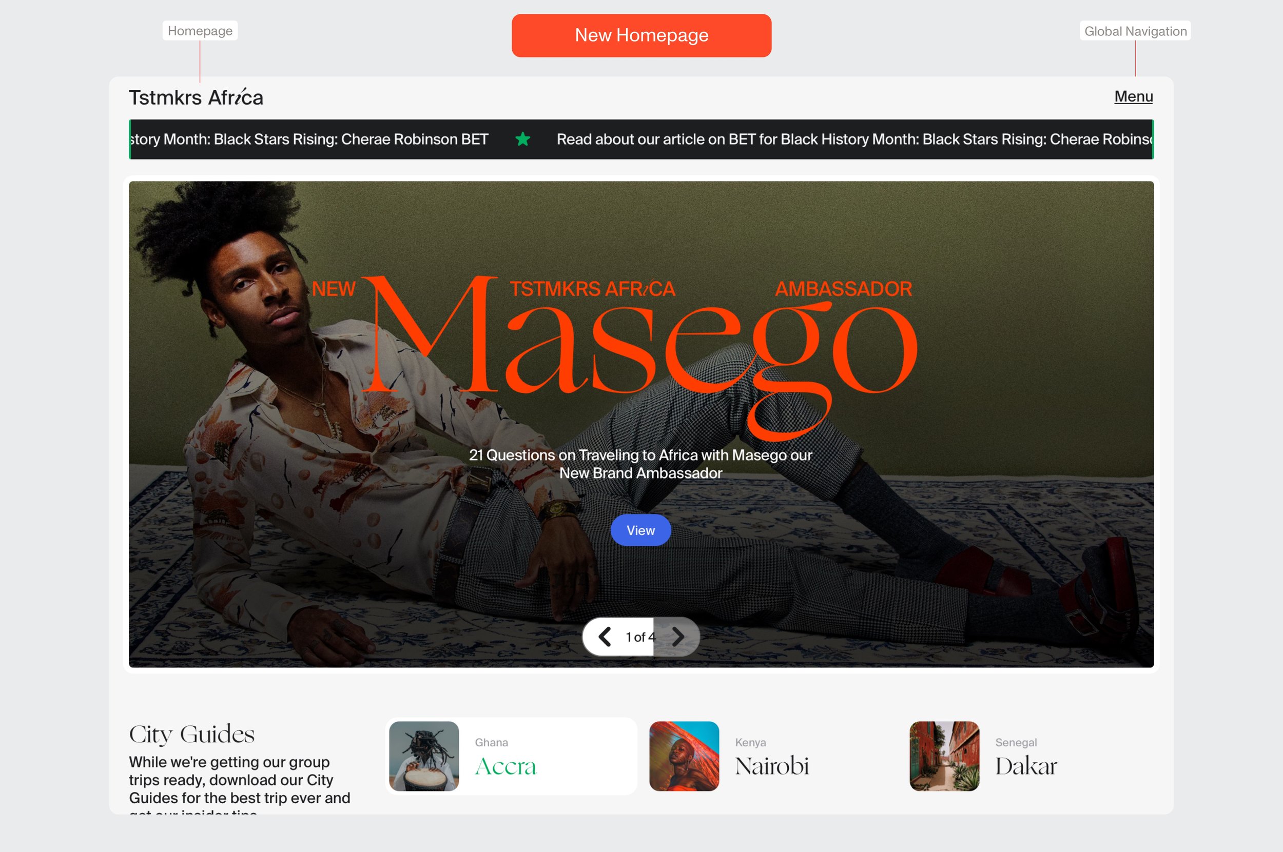
Tastemaker’s relies on a robust ecosystem of events, articles, and visual storytelling between trips to boost purchase confidence for future travelers. We found user’s typically landed on the homepage after being redirected from an article on a media outlet —product education was happening elsewhere. This told us users were ready were coming to take action when they land on the site.
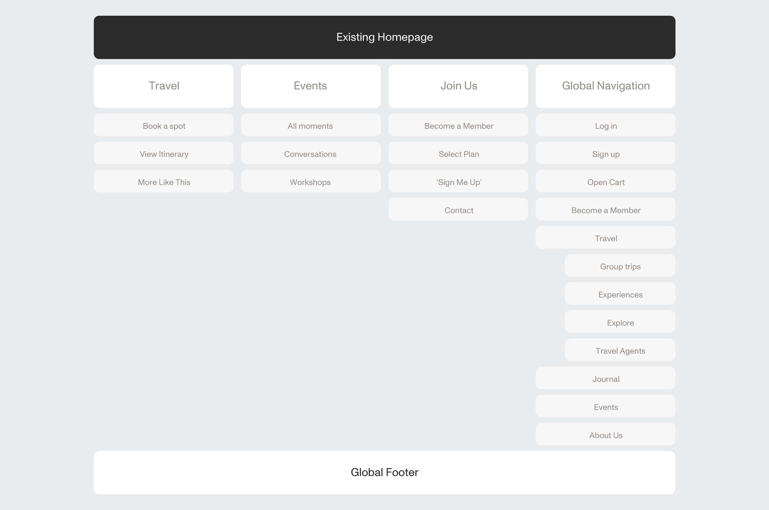
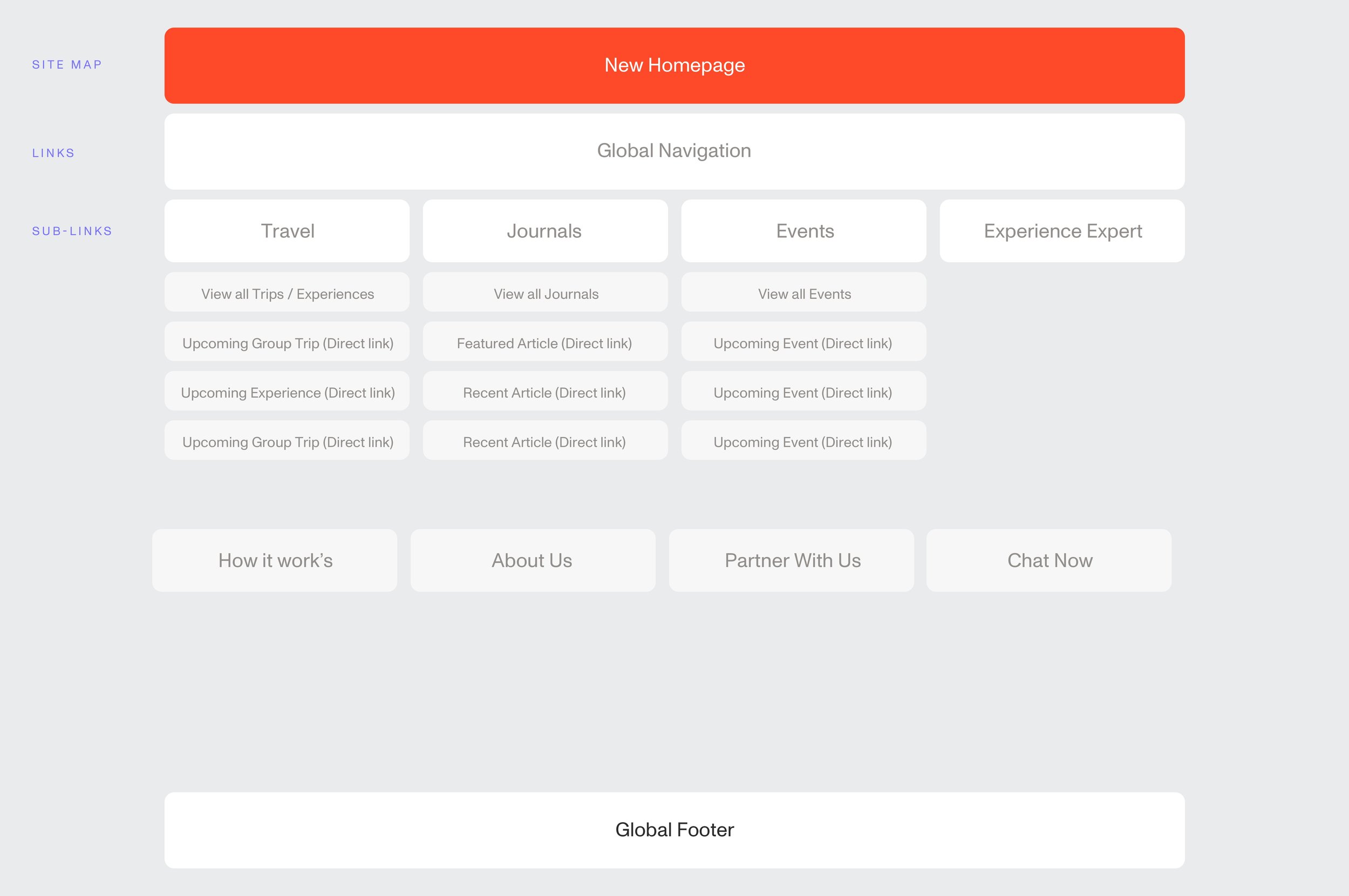
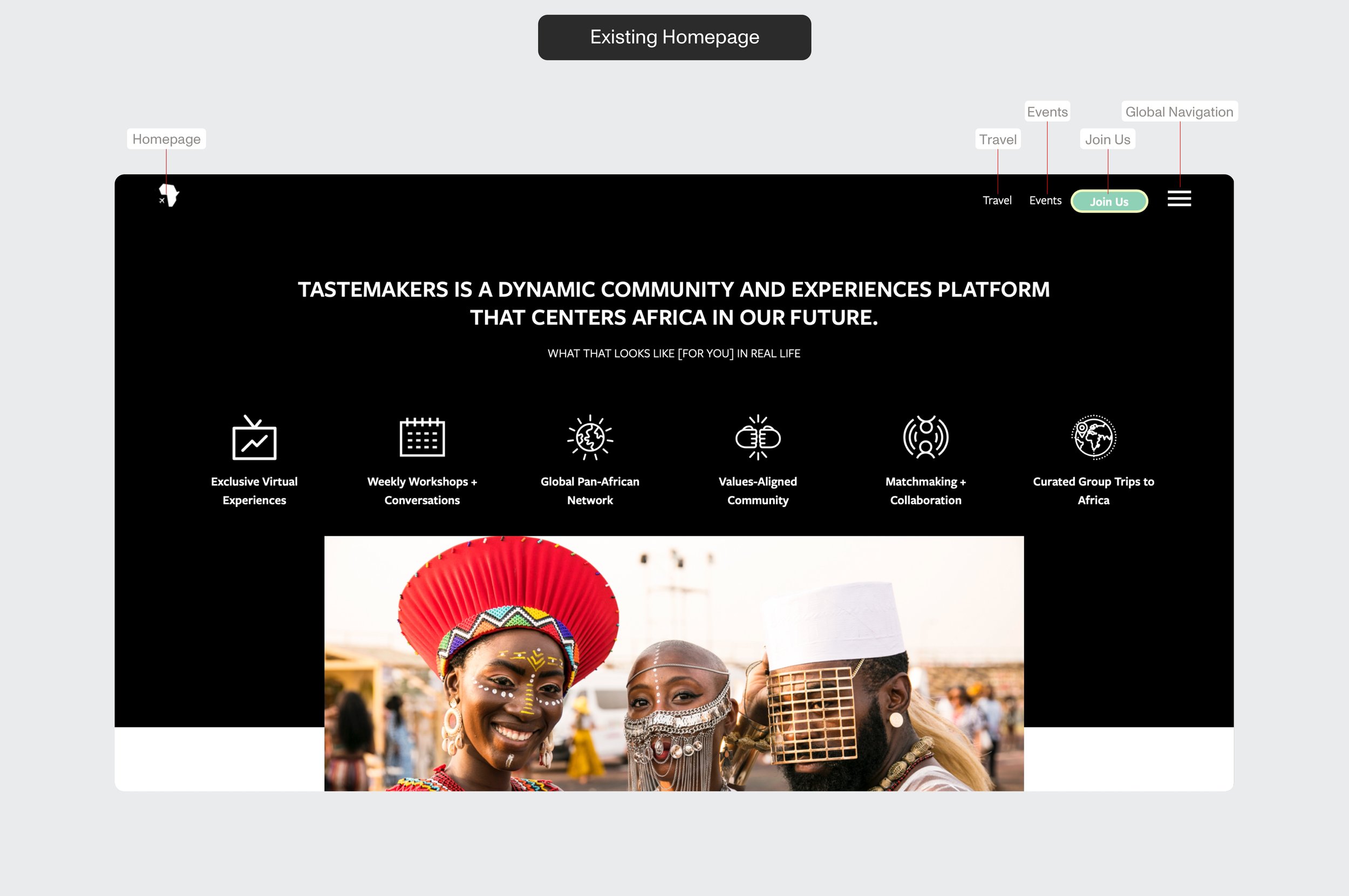
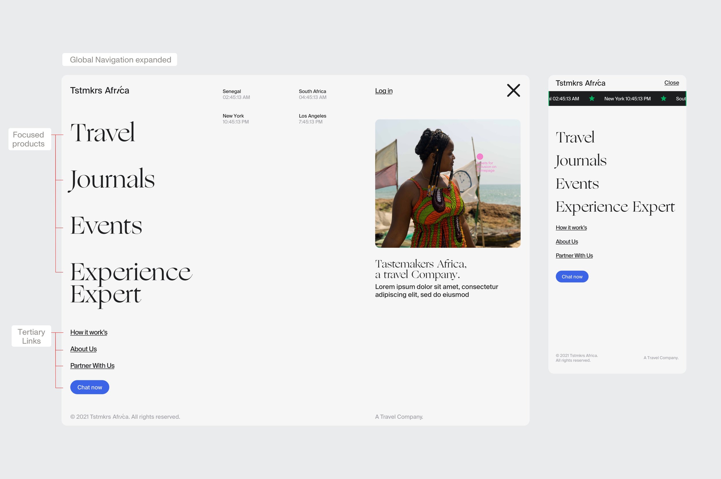
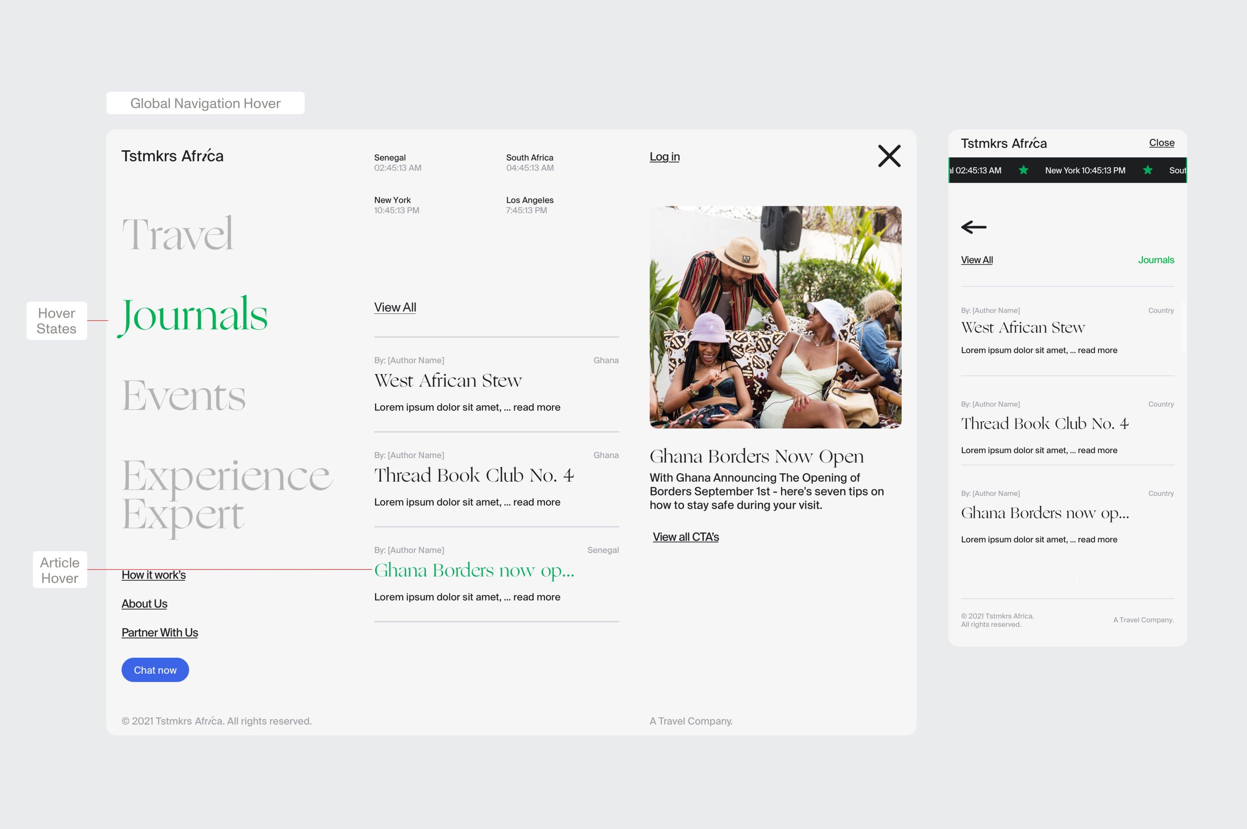
The existing homepage was long and buried any actions (joining events, signing up for trips and experiences) far down the experience, where only 25% of users were making it to their product offering. Since product learning was secondary given the users entry points, we transitioned the homepage to a modular content feed , bringing core products (events, journals, trips and experiences) right below the fold with clear CTA’s. We also simplified the global navigation and turned it into a discovery-led dashboard for their core products .


To solve for the content fragmentation around the site, we moved all products to a responsive card system which come in three sizes for visual prominence. This allowed us to use the same visual elements around the site for easier navigation and content groupings, while also flexible enough to support new future product offerings.


We reprioritzed rich content on both journal and trip sales templates for visual interest. At the end of each trip sales page or journal, we grouped related products using the same homepage modules. We also introduced an infinity scroll experience, where scrolling through the end of the article would progress you immediately to the next article to encourage discovery.

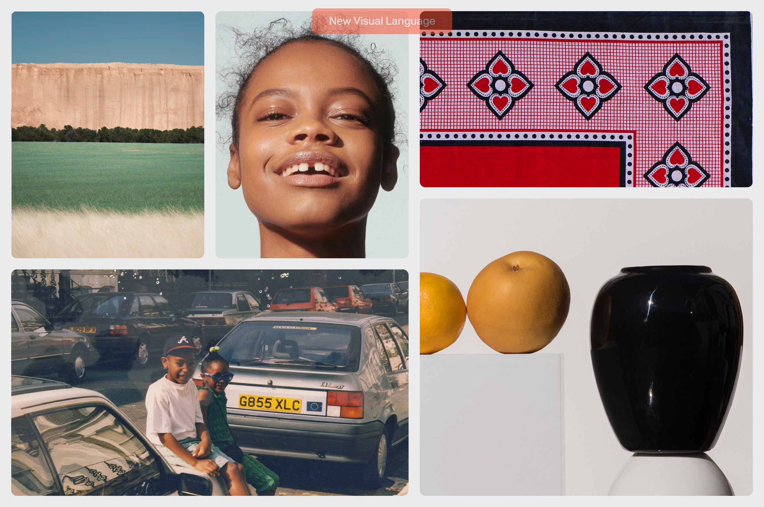
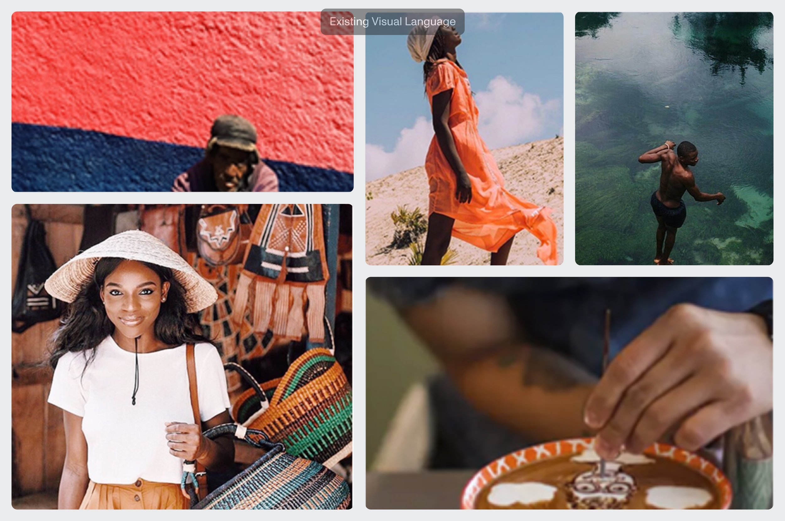
For the overarching visual direction, we led with the northstar of shedding light on ‘The Untold Story,’ inspired by travel motifs such as passports, tickets while bringing the warmth into the experience through bold colors and candid emotion in photography. Photographic tone included a key purchase driver for the experience like objects (merchandise), People, and Setting.


We went through a number of Serif and San-Serif options for global fonts on the site, ultimately landing on Suisse Int’l Book for all long-form and decision-content for legibility, and selected the Ogg family as our Impact typeface for headers, allowing for maximum flexibility in expression.

We ended up with a flexibilty design system which could support any combination of products that led with actionable discovery for users.


